Brand Identity Design
BRAND STRATEGY | NAME DEVELOPMENT | LOGO DESIGN | STATIONERY SYSTEMS | SIGNAGE
CHINESE SOUL FOOD
Logo for a chinese cooking blog and cookbook by a local chef and author.
ECO DIVERSION CALCULATOR
Logo and brochure for an online application that helps municipalities increase diversion and optimize their waste collection by giving them accurate data as to the amount of recyclables, compostables and garbage in their waste stream.
CTA DESIGN BUILDERS
Proposed logo for architecture office and general contractor.
Crestmont
Logo for upscale housing development.
FIRMANI AND ASSOCIATES
A long-time client and collaborator, Firmani and Associates Public Relations needed a look that was smart and contemporary without being too flashy. The die-cut corner and debossed area behind the logo give the card a dimensional element.
COLUMBIA BANK
This one dates us. From their humble beginnings in the early 90's Columbia Bank has grown to over 100 locations in Washington and Oregon.
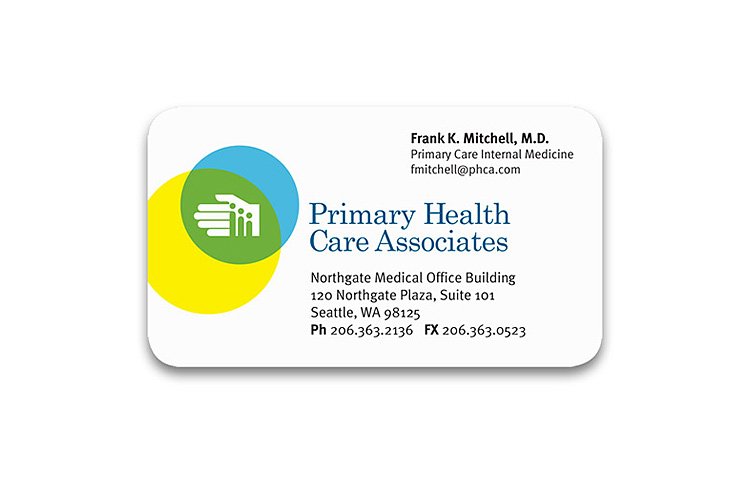
PRIMARY HEALTH CARE ASSOCIATES
Our goal for this medical practice's identity was to convey an atmosphere of professional, general care for the whole family. We developed a strong mark and combined it with a contemporary palette of primary colors.
CHEAP SLEEP LODGE
Logo for a budget extended stay hotel in south Seattle.
MARGAUX FINE HOMES
Margaux Fine Homes is a woman-run developer and builder of high-end, luxury custom homes. The brand identity called for a high-end architectural feel, reflective of the homes themselves, and with just a touch of femininity.
EKOS CORPORATION
This medical device manufacturer needed an update to their existing branding and web design. We gave them a sleeker, more cohesive logo that evoked the sonic qualities of their ultrasound product, and a much cleaner, more modern website design that appealed to their primary audience: physicians.
SEATTLE ENDODONTIC ARTS
This group of doctors needed a new name and identity that projected confidence to referring dentists and anxious patients alike. (The clinic specializes in root canals.) We chose soothing colors, and eliminated all sharp edges, to create an identity that exudes calm professionalism.
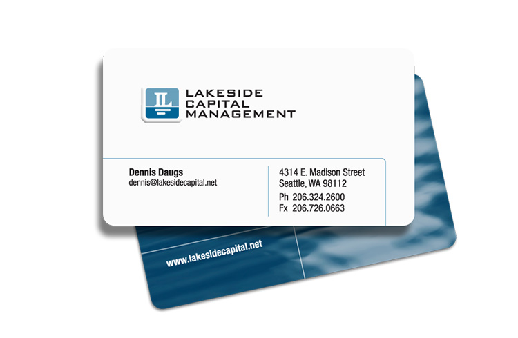
LAKESIDE CAPITAL MANAGEMENT
This young capital management firm needed a brand identity that reflected the conservative management philosophy of the principals. A placid water scene seemed to fit the bill. By an amazing coincidence, their offices just happened to be located by the lake.
See more in the Case Study.
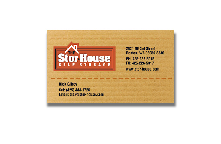
THE STORHOUSE
When a long-time home developer client decided to develop a series of self-storage facilities, Welsh & Co. came up with a name that made a subtle reference to their history, and a business card design that made a subtle reference to corrugated packing boxes.
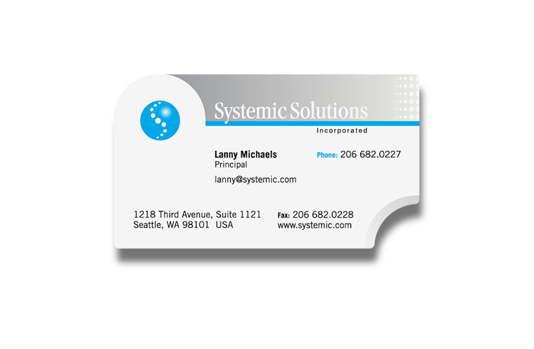
SYSTEMIC SOLUTIONS
A technology company dedicated to analyzing and streamlining systems operations in all types of organizations.









Blog